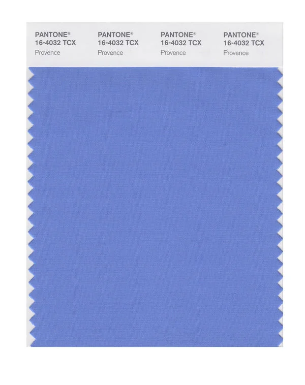
Provence - Pantone 16-4032 TCX
Provence is a medium-toned color from the Pantone TCX collection, identified by the code 16-4032 TCX. This cool tone with its balanced character makes it an excellent choice for premium branding, luxury services, and sophisticated design.
Provence

Digital Values
#658DC6101, 141, 19849%, 29%, 0%, 22%215, 46, 58.657.94, 2.03, -33.81Pantone Values
Provence16-4032 TCX659CRAL Values
5012Light Blue21Color Characteristics
This color exhibits a hue of 215°, 46% saturation, and 59% lightness, creating its distinctive cool appearance. The color translates beautifully across different mediums, from digital displays to cotton fabric swatches.
Design Applications
This versatile color is ideal for premium branding, luxury services, and sophisticated design. It also works beautifully in high-end products, ceremonial items, and elegant interiors.
Popular Industries: Luxury Services, Ceremonial Products, Premium Retail, Hospitality
Technical Details
Technical specifications include RGB values of 101, 141, 198, CMYK breakdown of 49%, 29%, 0%, 22%, and HSL coordinates of 215, 46, 58.6. The closest RAL equivalent is 5012 (Light Blue).
Design Tips
Combines well with warm accents for balanced compositions.
Colors Similar to Provence
Explore colors with similar hue, saturation, and lightness values that work well with Provence in design projects.
Color Collection
Explore more than 2800+ colors from the Pantone TCX collection to expand your design palette.