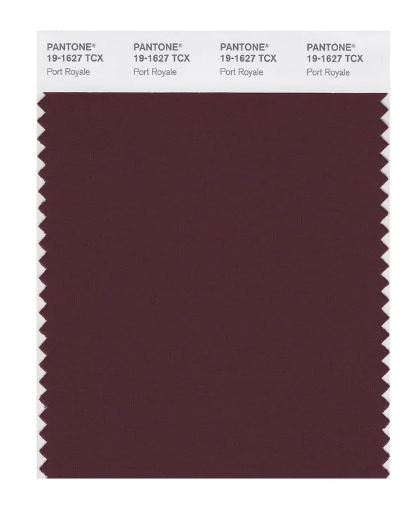
Port Royale - Pantone 19-1627 TCX
Port Royale is a deep and rich color from the Pantone TCX collection, identified by the code 19-1627 TCX. This warm tone with its balanced character makes it an excellent choice for wine industry, luxury goods, and sophisticated branding.
Port Royale
Digital Values
#502B3380, 43, 510%, 46%, 36%, 69%347, 30.1, 24.122.56, 18.23, 2.35Pantone Values
Port Royale19-1627 TCX504CRAL Values
3007Black Red2Color Characteristics
This color exhibits a hue of 347°, 30% saturation, and 24% lightness, creating its distinctive warm appearance. The color translates beautifully across different mediums, from digital displays to cotton fabric swatches.
Design Applications
This versatile color is ideal for wine industry, luxury goods, and sophisticated branding. It also works beautifully in formal dining, premium packaging, and elegant interiors.
Popular Industries: Wine & Spirits, Luxury Goods, Hospitality, Fashion
Technical Details
Technical specifications include RGB values of 80, 43, 51, CMYK breakdown of 0%, 46%, 36%, 69%, and HSL coordinates of 347, 30.1, 24.1. The closest RAL equivalent is 3007 (Black Red).
Design Tips
Pairs beautifully with cool tones for dynamic contrast. Excellent for creating depth and sophistication in designs.
Colors Similar to Port Royale
Explore colors with similar hue, saturation, and lightness values that work well with Port Royale in design projects.
Color Collection
Explore more than 2800+ colors from the Pantone TCX collection to expand your design palette.